Introduction
Founded in 1937, the Brentwood Public Library serves one of the largest school districts in New York. Their mission is to provide an environment for lifelong learning by making available responsive services and resources that inform, educate, and enrich the lives of the Brentwood community.

The CHALLENGE
The branding of the Brentwood Public Library did not match the look and feel of what the library was looking for. BLP was more than just a library of books, it is a community center that invites people from all walks of life. The library was looking for a fresh look that builds on top of the original brand. The goal of the new Brentwood Public Library branding is to create a professional brand that is inclusive, friendly, and inviting.
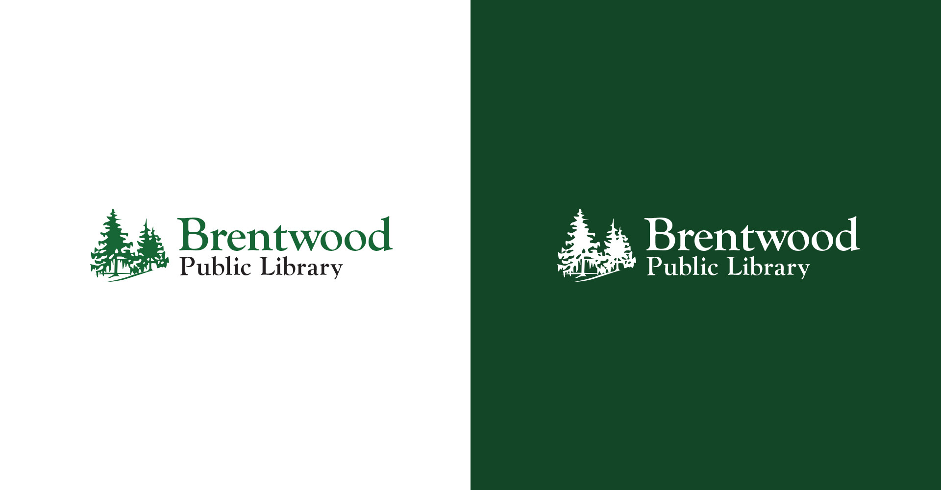
new, but familiar
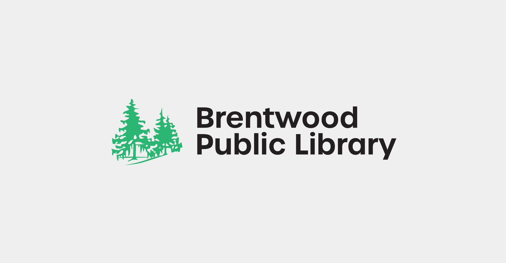
The new logo keeps the iconic trees the Brenwood community loves and is familiar with while updating the wordmark with a new friendly typeface that is more versatile to work on all mediums in print and digital works.
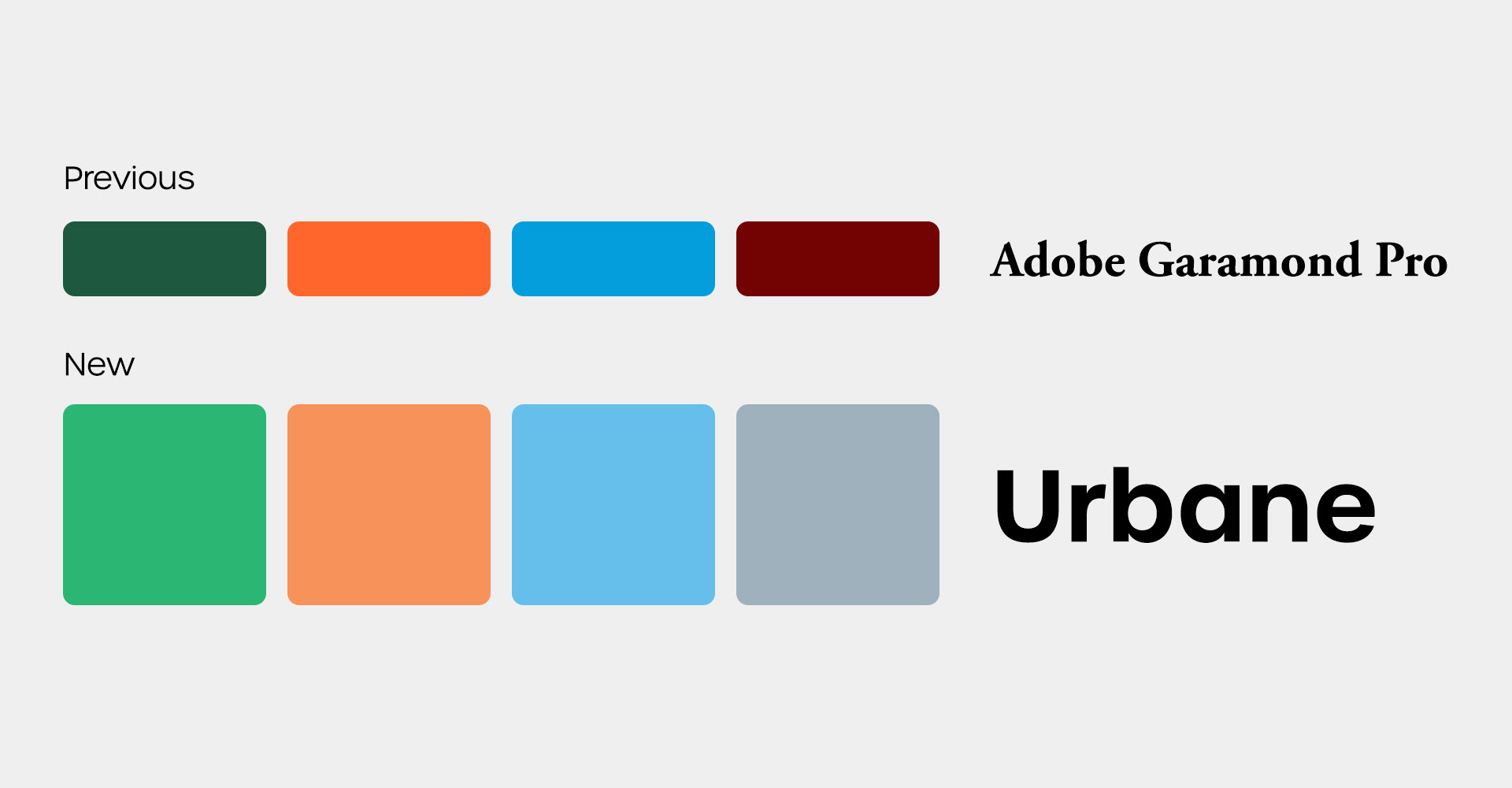
A Fresh Coat of Paint
The new color pallet is brighter and lighter than the previous dark and drab color pallet, creating a more friendly and inviting environment. The typeface is rounder, clearer, and an all-purpose workhorse font with wide applications for print or social media.
Social Media
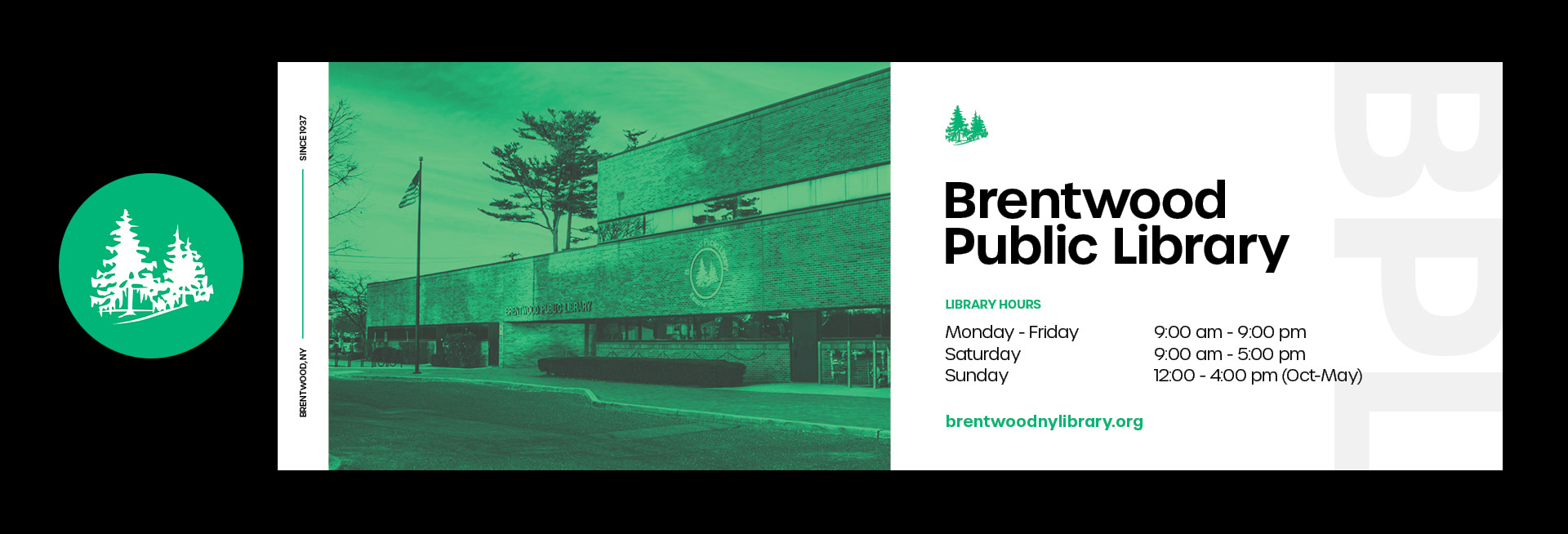


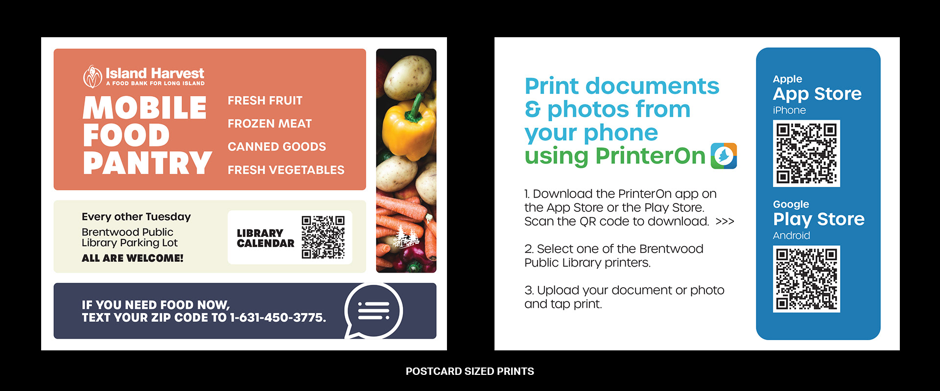
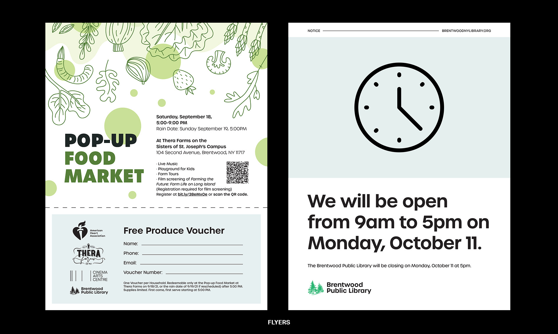
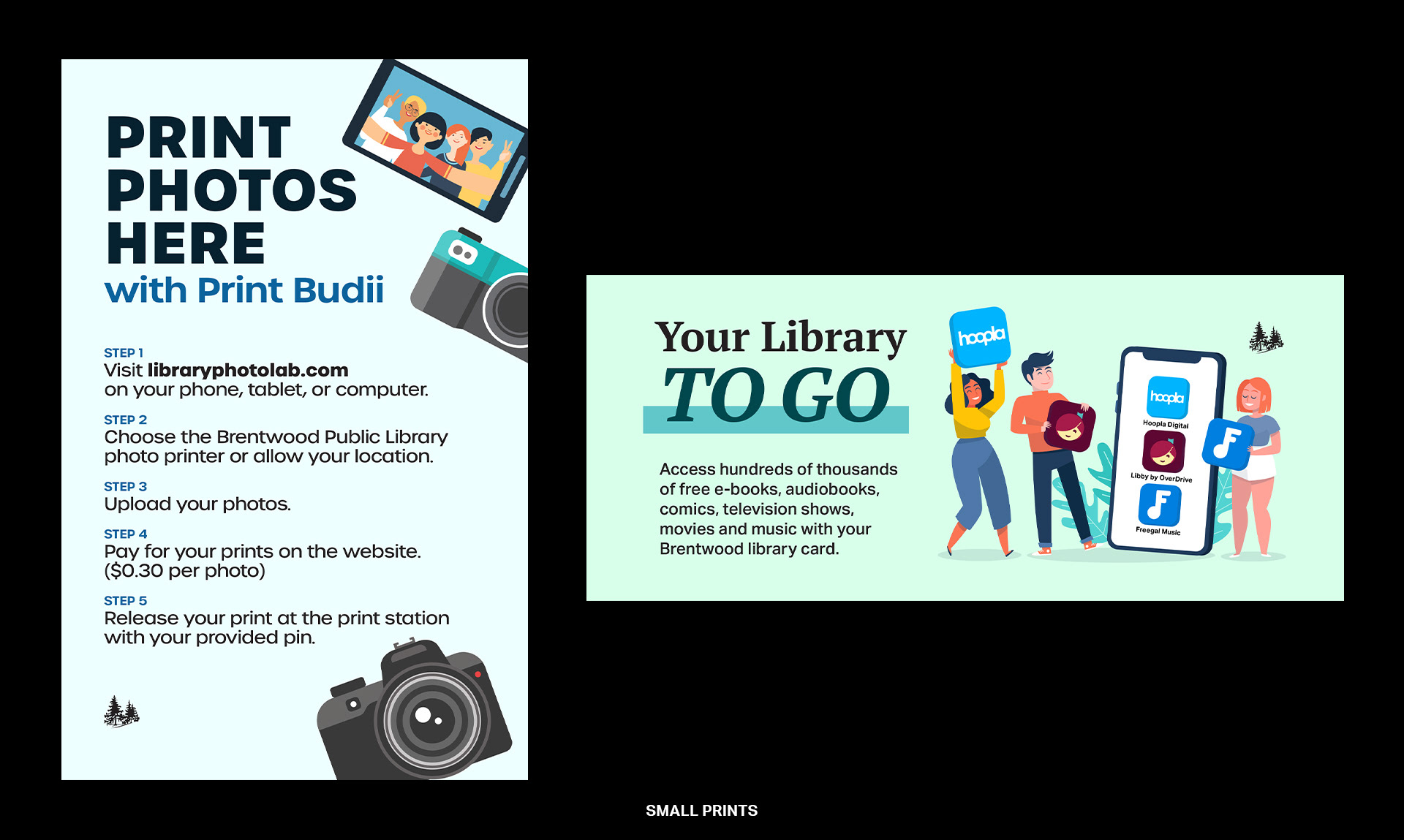
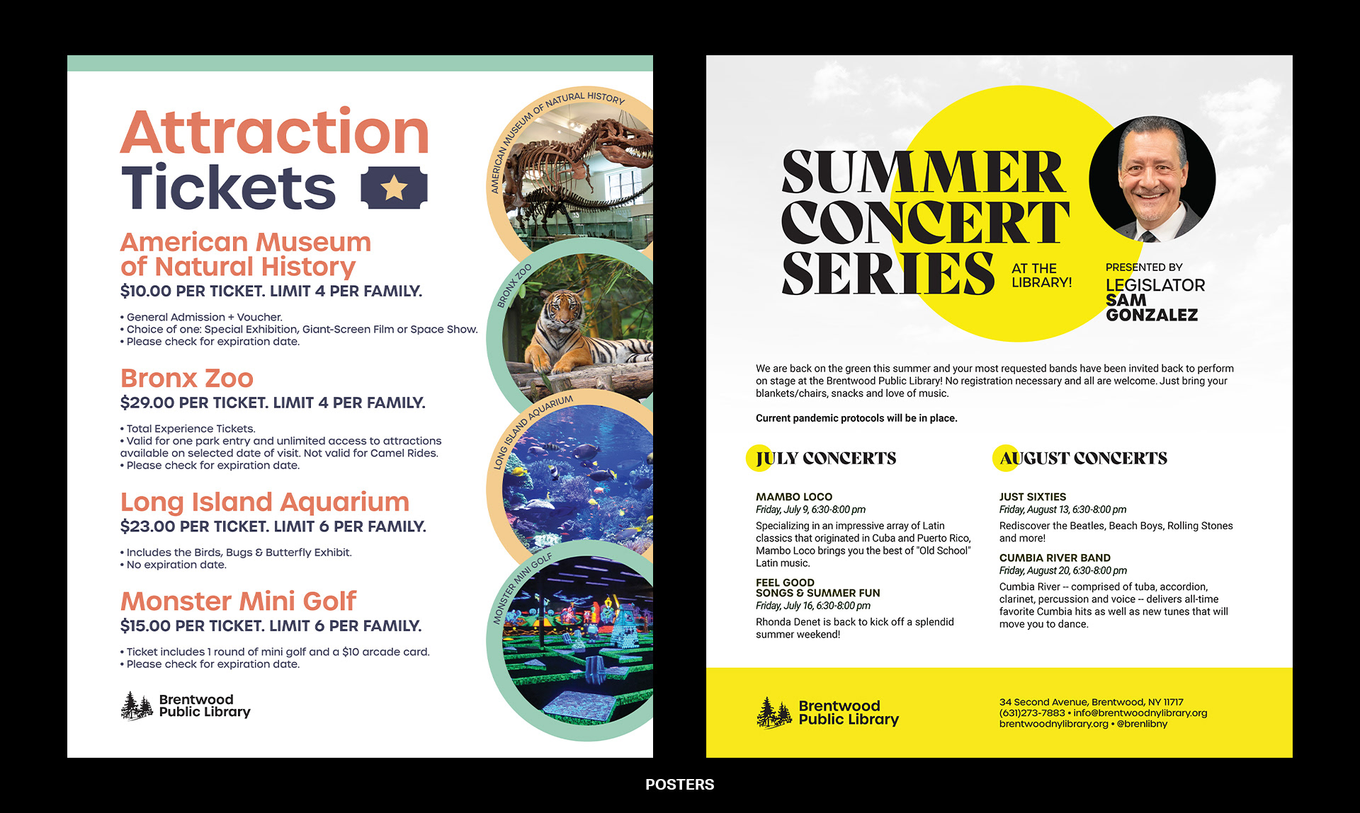
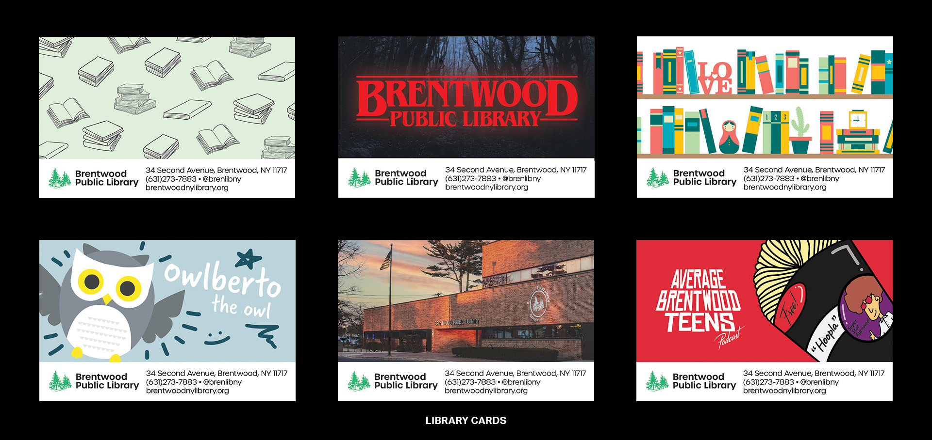
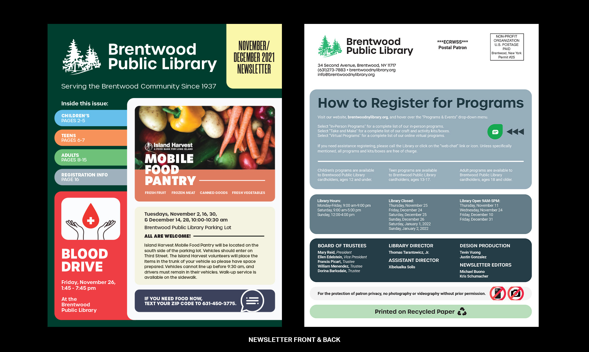
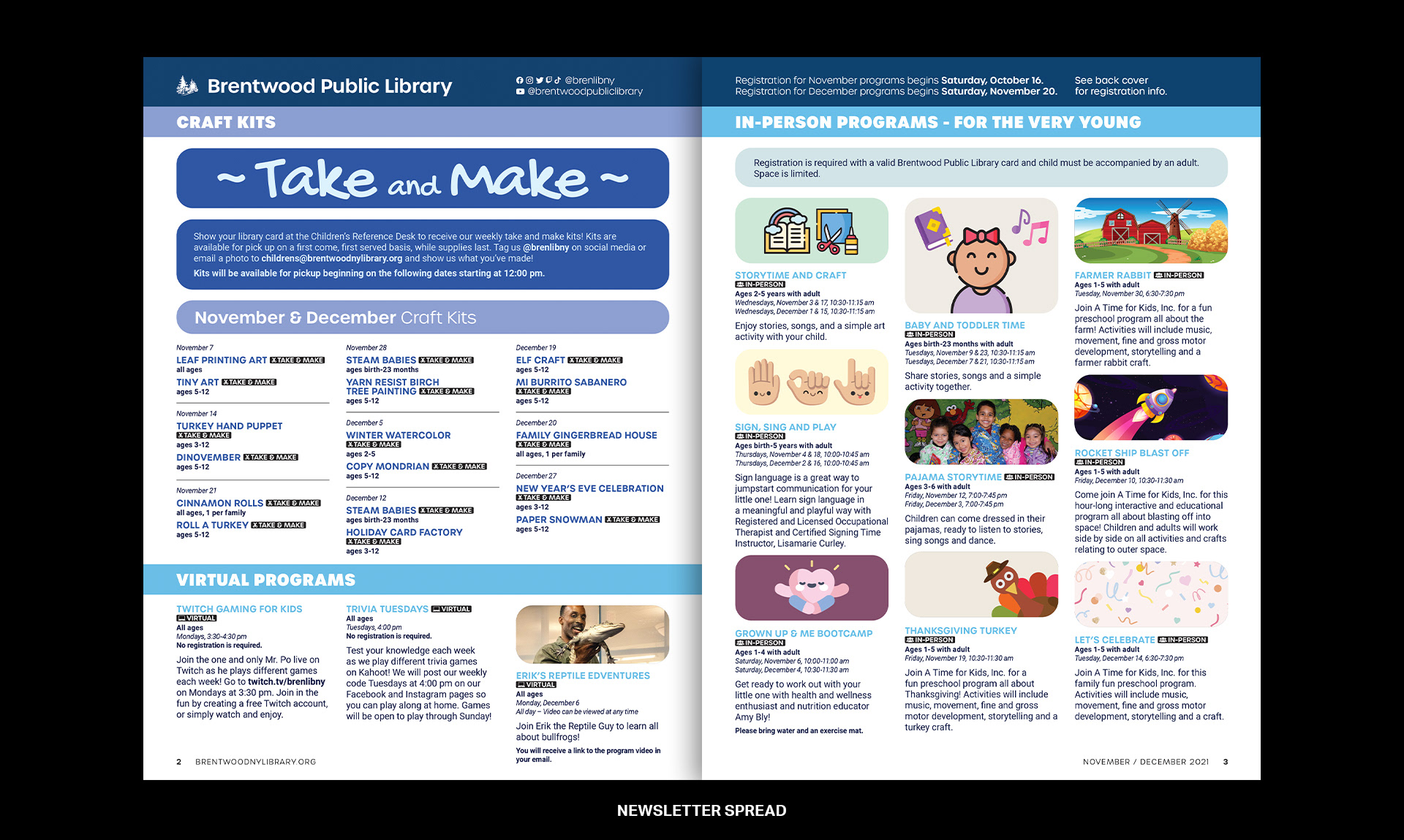
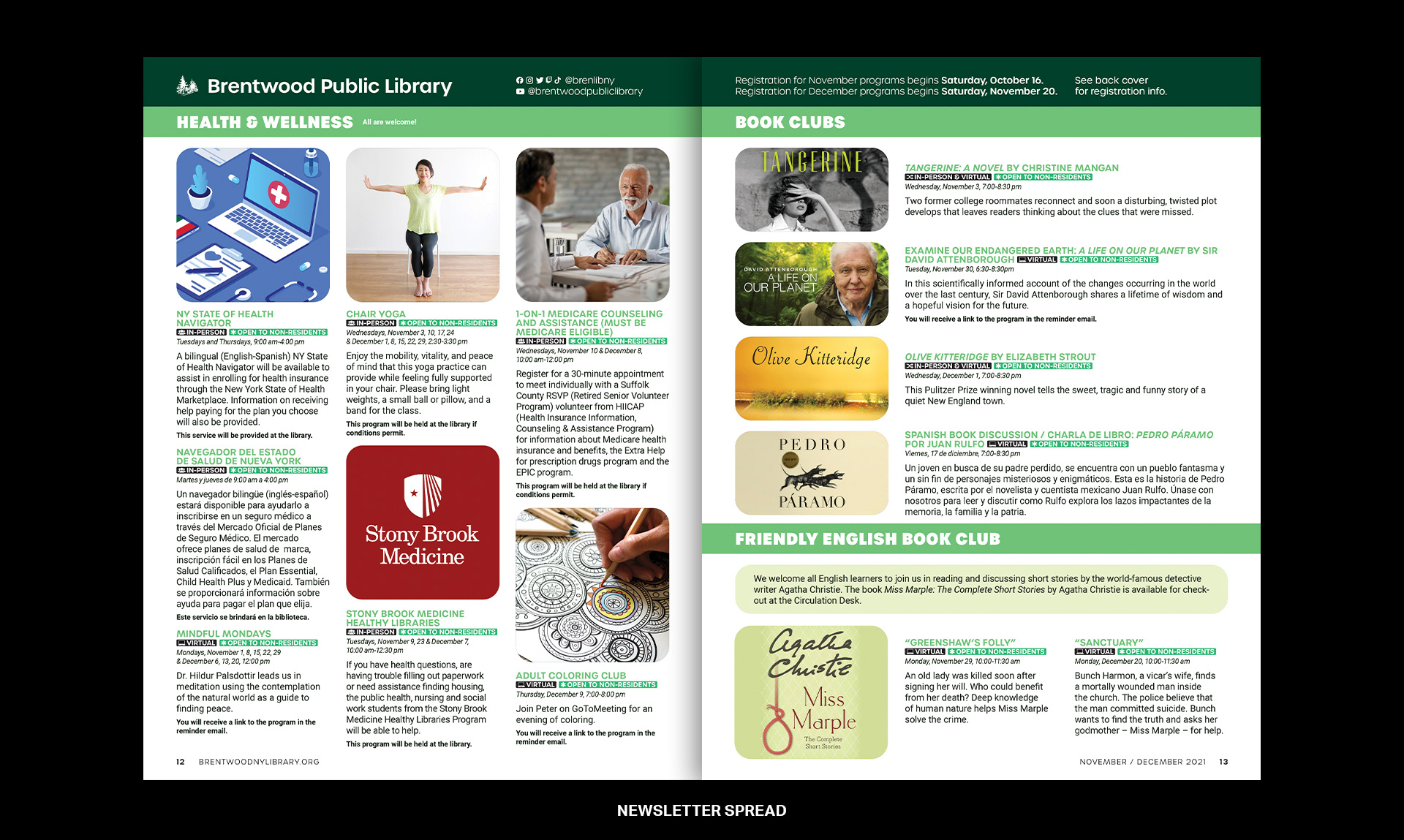
Print Material